Common automotive interaction design mistakes
Summary: People spend a great deal of time driving their cars, so cars should be as easy to use, and as effective as possible. However, most cars are filled with common design mistakes that are annoyances at the least, and often downright dangerous.
A friend and I visited the Toronto International Auto Show recently. I brought a digital camera to capture instances of "bad interaction design", much to the chagrin of my friend. What I found were even more examples than I had (cynically) expected. Following are some of the most common instances of bad design, which will hopefully disappear from cars in the near future.
#1: impractically tiny back seats
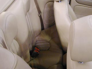
Jaguar makes a number of beautiful and luxurious cars, including a roadster that has an MSRP of around CDN$100,000. For that price (which doesn't include taxes) one would expect a pinnacle of design excellence. While the controls are reasonable, and the car is most certainly above average in almost every respect, it has an almost unbelievably tiny back seat. The back seat is, for all intents and purposes, unusable. I am not sure if any person can comfortably or safely sit in the rear of that Jaguar. And so, the design is ineffective. Jaguar should have saved the poor animals that were sacrificed to obtain the leather for the back seat, and instead made the cargo space larger.
I have been told that the back seat was probably not designed with users in mind, but import regulations, fleet fuel economy standards, and tarriffs instead. On a car this expensive, Jaguar should accept its losses and produce a vehicle that is most effective for users. If the back seat is good for temporarily storing a tennis bag or other small articles, a well-designed cargo space (not part of the trunk) would have been a much smarter design.
#2: non-standard outside door handles
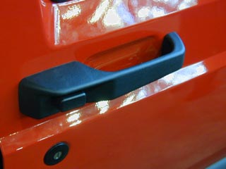
Non-standard door handles wouldn't be a problem if they were better than existing designs. Jeep uses this non-standard door handle on some of its models, and it's a must-go. Firstly, the handle is unlike most of the door handles found on other vehicles. Secondly, the handle requires more time to learn and understand than simpler, more obvious door handles. Although this door handle does have appropriate affordances, it's still too difficult to be used by everyone. Users will realize that it must be grasped, and then a small button on the handle must be pushed with a thumb. Finally, the entire apparatus must be pulled to open the door. This design discriminates: users with special needs may have a hard time getting the door open. The handle requires extra thought, and fine motor skills that many users don't have.
#3: impractical clock-setting mechanisms
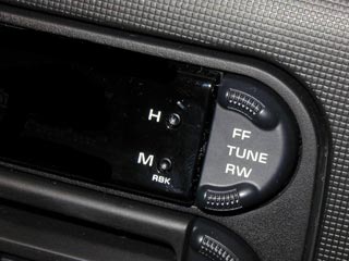
If a user is driving and notices the clock is wrong, they want it fixed as soon as possible, so that they won't be late, or too early, or just so that they can be aware of the time. As in the above example, most cars make setting the clock when it is required nearly impossible. I wouldn't ask any driver to continue their trip while trying to find a pointed object with which to set their car clock. Drivers have to find a special tool and spend some time playing around with the mechanism. Since the clock is so important to users' daily lives, it should be easier to set. That can be accomplished through easy-to-operate buttons, or even by automatic synchronization.
A reader pointed out that if a clock is to easy to set, the time may be accidentally changed. Perhaps clock setting buttons should be hidden behind a labeled door.
The same reader also mentioned that correct time on the clock isn't imperative for proper operation of the vehicle. However, it is imperative for proper operation of the driver. Cars get people from A to B, and those people have scheduled lives.
#4: relevant information out of reach
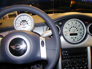
BMW is re-releasing the Mini, a popular and "cute" car. But like many new cars, the layout of devices that convey urgent and necessary information to the driver is totally skewed, and even dangerous. In the Mini, the tachometer, which shows information that is relevant to the car, not the driver, is located where the traditional information-conveying dash is. The speedometer, which conveys information that users need, is located in a slightly lowered position in the center dash. I cannot explain that; it is absolutely dangerous and asinine design. If drivers want to know how fast they're going, which all drivers should want to know for safety reasons, they have to take their eyes off the road. That can be deadly. Drivers should have the most important information (especially related to safety) right at their fingertips.
Even though BMW seems to have the wrong idea about good interaction design in future cars, Volvo is making strides efforts to improve it in theirs. Volvo's Safety Car Concept includes a heads-up display that makes important safety information even more perceptible. Beware, though: Volvo's website is filled with pop-up windows.
#5: unlabeled controls, identical controls, and non-control controls
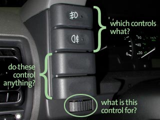
Unfortunately, I didn't record the type of vehicle that contained this pitiful example of interaction design (note: I now believe that it was either a Nissan or a Saab). In any case, there are a few problems. Firstly, two of the buttons have nearly identical icons, neither of which are obvious (nor standard, as I found out from a reader). Feel free to tell me what you think they represent.
Secondly, the two unlabeled pieces of plastic have the same button affordances as the top two, but they do nothing. If they're not buttons, they shouldn't look like buttons. The fake buttons could throw users off, cause them to be distracted, and potentially cause deadly accidents.
Lastly, the dial beneath the four buttons is not labeled, and it's horizontal. Most similar dials that users encounter in their lives are vertical, indicating increase or decrease (analogous to fluid in a clear container). Horizontal dials are more difficult to use, especially if the user has no idea what the dial does. Sure, the user can learn what the dial does, but trial-and-error while driving can be very dangerous.
A logical explanation for the mistakes
Drivers should be familiar with their cars before they drive them. That doesn't excuse car companies that fill their cars with obvious design mistakes--designs that require customers to re-learn everything they know about operating a vehicle. Drivers have other things to do with their lives, and they should be encouraged to quickly become safer, more effective drivers, not unsafe and confused drivers.
Adam Baker is a user experience designer who's worked at Google, Apple, BlackBerry, and Marketcircle, and mentored startups in Vancouver.